In my role as a UX/UI Designer at All4running, I was responsible for redesigning the header with a focus on enhancing visual consistency, improving content structure, and optimizing overall navigation.
I conducted research to identify key areas for improvement and translated these insights into a refined design solution. The new header was strategically developed to create a clearer content hierarchy and improve user flow across the platform.
Ux/Ui Designer
Role:
Problem analysis, competitive analysis, Research synthesis, Ideation, Stakeholder management, Cardsorting activities, leading meetings, Ideation, concept dessign.
Skills:
Figma, FigJam, Hotjar
Toolkit:
Outcome
Restructuring the header and menu’s navigation
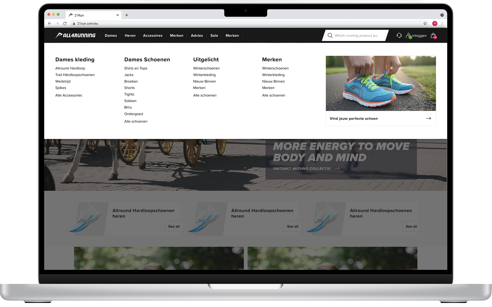
I designed the mvp of a header and navigation with an improved visual and content structure that includes clear category descriptions that communicate their content instantly. The streamlined user flow guides visitors efficiently to relevant product overview pages, helping them quickly find the products they are interested in.
All products link
An “All Products” option was introduced in the navigation to ensure users can quickly access an overview page displaying multiple products within a category. This helps streamline the browsing experience and improves overall user flow.
Clear categories
Categories were restructured to be broader and more intuitive. Instead of highly specific labels, we implemented inclusive category groupings that guide users to product overview pages featuring a wide range of items. From there, users can easily refine their selection using filters.
Reduced visual overload
The design focuses only on essential components that guide users toward category and product overview pages. By removing unnecessary elements, we reduced visual clutter and created a more focused, efficient navigation experience.
Research and research synthesis
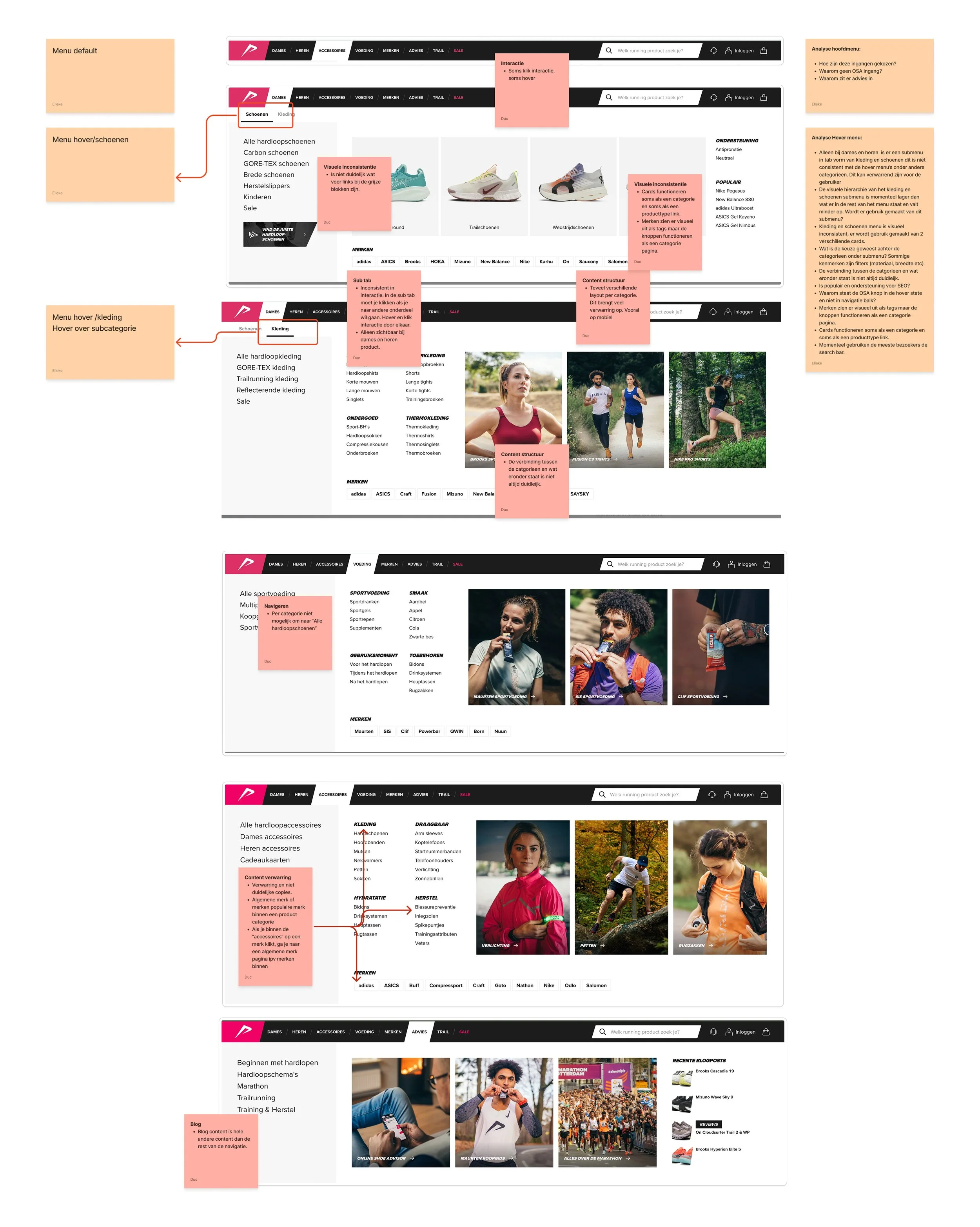
Analysis of current UI
I conducted a comprehensive UI analysis, identifying inconsistencies in the user experience, component usage, and visual and textual communication.
A review of Hotjar recordings revealed an early drop-off among users navigating both the desktop and mobile menus. Many users abandoned the menu and switched to the search function instead. This behavior indicated visual overload and a category structure that was either unclear or did not align with what users were looking for.
A deeper analysis of the menu highlighted several key issues:
Visual overload caused by an excessive number of elements
Card components serving dual purposes, functioning both as category links and product links
Brand category links styled like tags but behaving as buttons or tabs
Confusing or unclear category naming
Inconsistent user journeys, where product links sometimes led to a specific product-type overview instead of the main category overview
Significant variation in UI design across different category menu screens
Inconsistent terminology, alternating between product attributes and product categories
These findings provided a clear foundation for restructuring the navigation and improving clarity, consistency, and overall usability.
To address this, we focused the redesign on three core principles:
1. Visual and Content Consistency
Components should have a clear and recognizable function within the UI. Each component must be used consistently across the platform to avoid confusion and build familiarity.
2. Content Structure and Navigation
Terminology should be intuitive and clearly communicate the expected outcome of a selection. The navigation structure must guide users logically toward relevant product overview pages.
3. Interaction and Device Consistency
Menus should function consistently across all breakpoints. Interactions within the menu must behave the same way on every screen, ensuring a seamless experience across desktop and mobile devices.
Ideation and Design
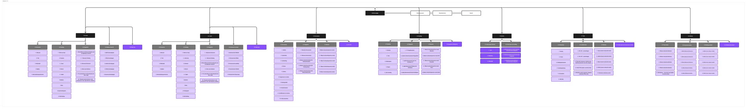
Restructuring content into encapsulating categories
A cross-functional team—including the SEO specialist, Product Owner, Development Manager, and I, the UX/UI designer—led the effort to restructure category names and implement semantic improvements.
As the UX/UI designer, I facilitated several workshops to reorganize the categories and establish a clear distinction between the main menu navigation and the filter menu on product overview pages. Creating categories that are encapsulating a wider range of products and decreasing the User Journey leading to an overview page to a maximum of three clicks.
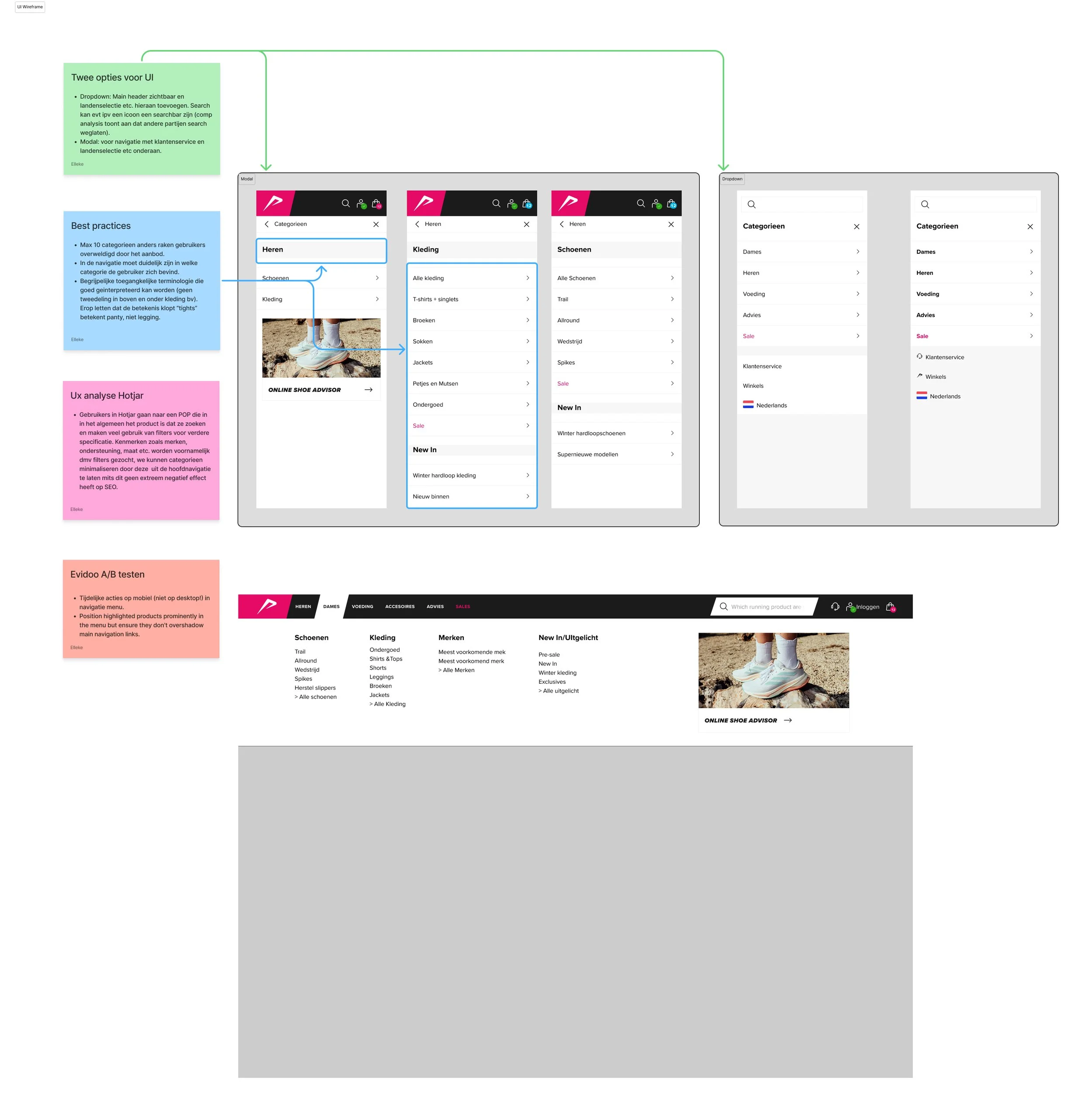
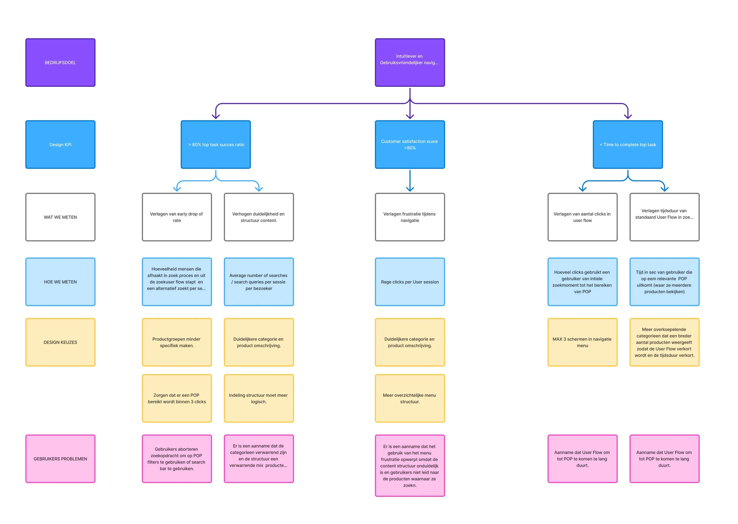
Creating Wireframes and connecting KPI’s
Protoypes and Testing
Using the wireframes, I developed an MVP to validate the design’s effectiveness. I aligned design decisions with business goals and defined KPIs to measure the performance of the improved header.
Following decisions made in the ideation phase, I created wireframes to explore multiple designs showcasing the new navigation structure and updated category system. I included best practices and offered solutions to problems mapped ou in the research phase.
In order to measurer the functionality of the design I created Design KPI’s which I connected to business goals. This makes it able for me to measure a specific design decsion.
The MVP is currently being implemented by the All4running development team, with plans to conduct user testing later this year to further evaluate usability and impact.